06 10 01 85 40
contact@clement-charlotte.fr


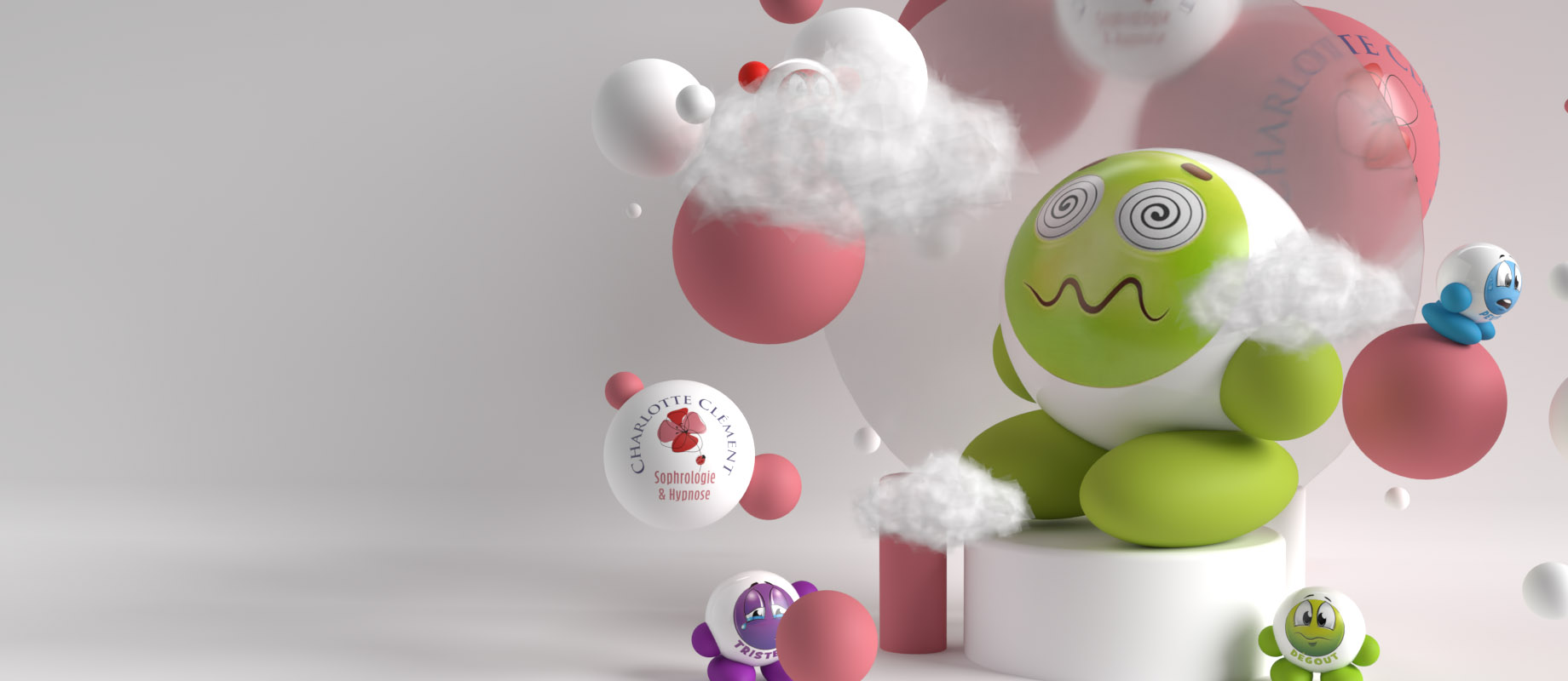
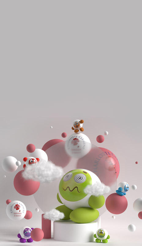

JE SUIS CHARLOTTE
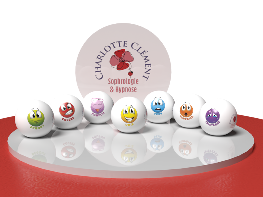
Mes spécialités
Mes spécialités
Sophrologue spécialisée dans l'enfance et l'adolescence et praticienne en hypnose.
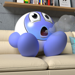
SOPHROLOGIE
La sophrologie étant basée sur des exercices de respiration
Home : Sophrologie
avec de la détente et contraction musculaire
ainsi qu'une partie de visualisation pour permettre de libérer l'esprit.
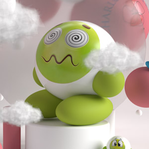
HYPNOSE
En hypnose, on cherche a atteindre un état modifié de conscience
Home : Hypnose
afin de faire évoluer des ressentis
et/ou de modifier des souvenirs douloureux.
POUR QUI ?
Home : Enfance
L'enfance est la première période de la vie humaine. En sophrologie, on divise en deux cette période : la première enfance et la deuxième enfance.
Home : Adolescence
L'adolescence est la transition entre l'enfance et l'âge adulte. Cette période entraîne une remise en question sur les concepts, valeurs et/ou croyances.
Informations
Les séances sont de 110 euros en fonction de la demande. À mon cabinet, 17 rue de la madeleine 28230 EPERNON au 1er étage sans ascenceur, accueil du mardi au samedi de 9h à 19h dernier rdv possible. N'hésitez pas à me contacter pour plus de précisions.
Informations Home
 En sophrologie, j'interviens pour les enfants dès l'âge de 3 ans et les adolescents jusqu'à l'âge de 21 ans .
Le premier rendez-vous dure 2h quelque soit votre demande et les autres séances durent entre 45 mn et 1h.
La première séance au cabinet est de 90 euros et les autres sont de 60 euros.
La présence d'un ou des parents est obligatoire lors du premier rendez-vous de sophrologie, si cela concerne un enfant de moins de 11 ans.
Certaines mutuelles prennent en charge une partie des séances de sophrologie, je vous invite à prendre contact avec elles directement. En hypnose, pour les enfants et les adolescents, cette pratique se fait en fonction de la demande.
Je privilégie cette méthode pour les traumatismes, les deuils et addictions. Une ou plusieurs séances d'hypnose peuvent être réalisées en complément d'un accompagnement en sophrologie.
Les séances durent en moyenne 2h.
Typography
Base
This section shows the base look of all HTML elements on your page.
Headings
Use the <h1> to <h6> elements to define your headings.
h1. Heading 1
h2. Heading 2
h3. Heading 3
h4. Heading 4
h5. Heading 5
h6. Heading 6
Text-level semantics
The following list gives you a short overview of the most commonly used text-level semantics and how to utilize them.
| Element | Description |
|---|---|
<a>
|
Turn text into hypertext using the a element. |
<em>
|
Emphasize text using the em element. |
<strong>
|
Imply any extra importance using the strong element. |
<code>
|
Define inline code snippets using the code element.
|
<del>
|
Mark document changes as deleted text using the |
<ins>
|
Mark document changes as inserted text using the ins element. |
<mark>
|
Highlight text with no semantic meaning using the mark element. |
<abbr>
|
Define an abbreviation using the abbr element with a title. |
<dfn>
|
Define a definition term using the dfn element with a title. |
<small>
|
De-emphasize text for small print using the small element. |
Horizontal rule
Create a horizontal rule by using the <hr> element. The greyish line below each section here in the Typography page is an example.
Blockquotes
For quoting multiple lines of content from another source within your document, use the <blockquote> element.
Lorem ipsum dolor sit amet, consectetur adipisicing elit, sed do eiusmod tempor incididunt ut labore et dolore magna aliqua. Ut enim ad minim veniam.
Someone famous
<blockquote>
    <p>Quotation</p>
    <small>Source</small>
</blockquote>
Code blocks
For multiple lines of code, use the <pre> element which defines preformatted text. It creates a new text block that preserves spaces, tabs and line breaks. Nest a <code> element inside to define the code block.
IMPORTANTBe sure to escape any angle brackets in the code for proper rendering.
<pre>
    <code>...</code>
</pre>
Lists
Create an unordered list using the <ul> element and the <ol> element for ordered lists. The <li> element defines the list item.
- Item 1
- Item 2
- Item 1
- Item 2
- Item 1
- Item 2
- Item 3
- Item 4
- Item 1
- Item 2
- Item 1
- Item 2
- Item 1
- Item 2
- Item 3
- Item 4
<ul>
    <li>...</li>
    <li>...
        <ul>
            <li>...</li>
        </ul>
    </li>
</ul>
<ol>
<li>...</li>
<li>...
<ol>
<li>...</li>
</ol>
</li>
</ol>NOTEYou can also use additional UIkit classes for the lists. You will find more details here.
Description lists
Create a description list using the <dl> element. Use <dt> to define the term and <dd> for the description.
- Description lists
- A description list defines terms and their corresponding descriptions.
- This is a term
- This is a description.
- This is a term
- This is a description.
<dl>
    <dt>...</dt>
    <dd>...</dd>
</dl>NOTEYou can also use additional UIkit classes for the description lists. You will find more details here.
Tables
You can easily create tables using the <table> element. Use <thead> to define the table headings, <tfoot> to define the table footers and <tbody> to define the table body.
| Table Heading | Table Heading | Table Heading |
|---|---|---|
| Table Footer | Table Footer | Table Footer |
| Table Data | Table Data | Table Data |
| Table Data | Table Data | Table Data |
| Table Data | Table Data | Table Data |
<table>
    <thead>
        <tr>
            <th>...</th>
        </tr>
    </thead>
    <tfoot>
        <tr>
            <td>...</td>
        </tr>
    </tfoot>
    <tbody>
        <tr>
            <td>...</td>
        </tr>
    </tbody>
</table>NOTEYou can also use additional UIkit classes for the tables. You will find more details here.
Form
You can easily create forms that contain different elements like <legend>, <input>, <select>, etc.
<form>
    <fieldset>
        <legend>...</legend>
        <input type="text" placeholder="">
        <input type="password" placeholder="">
        <select>
            <option>...</option>
            <option>...</option>
        </select>
    </fieldset>
</form>NOTEYou can also use additional UIkit classes for the forms. You will find more details here.
Grid
This section shows how you can create different grids layouts with columns and rows.
Gantry5 Grid System
Gantry5 comes with its own CSS framework called "Nucleus". It is based on the Flexbox model and therefore is really flexible and allows you to build advanced layouts.
Block 1
Block 2
Block 3
<div class="g-grid">
    <div class="g-block">
        <div class="g-content">...</div>
    </div>
    <div class="g-block">
        <div class="g-content">...</div>
    </div>
    <div class="g-block">
        <div class="g-content">...</div>
    </div>
</div>
Gantry5 grid system or better said "Nucleus" grid system does not have a grid gutter, it uses the .g-content class instead.
As you can see in the above example, all 3 blocks are surrounded by empty space. This empty space comes from the .g-content class which adds some margin and padding to the element.
We have added a utility class to the template which takes care of the unnecessary spacing and makes the whole grid looks more natural. The utility class is called .g-gutter.
Block 1
Block 2
Block 3
<div class="g-grid g-gutter">
    <div class="g-block">
        <div class="g-content">...</div>
    </div>
    <div class="g-block">
        <div class="g-content">...</div>
    </div>
    <div class="g-block">
        <div class="g-content">...</div>
    </div>
</div>
"Nucleus" comes with another very useful class called .size-# where # is the percentage of the whole width of the grid a particular element should occupy.
Block 1
Block 2
Block 3
Block 1
Block 2
Block 3
Block 1
Block 2
Block 1
Block 2
<div class="g-grid g-gutter">
    <div class="g-block size-20">
        <div class="g-content">...</div>
    </div>
    <div class="g-block size-60">
        <div class="g-content">...</div>
    </div>
    <div class="g-block size-20">
        <div class="g-content">...</div>
    </div>
</div>

<div class="g-grid g-gutter">
    <div class="g-block size-20">
        <div class="g-content">...</div>
    </div>
    <div class="g-block size-20">
        <div class="g-content">...</div>
    </div>
    <div class="g-block size-60">
        <div class="g-content">...</div>
    </div>
</div>

<div class="g-grid g-gutter">
    <div class="g-block">
        <div class="g-content">...</div>
    </div>
    <div class="g-block">
        <div class="g-content">...</div>
    </div>
</div>

<div class="g-grid g-gutter">
    <div class="g-block size-25">
        <div class="g-content">...</div>
    </div>
    <div class="g-block size-75">
        <div class="g-content">...</div>
    </div>
</div>
UIkit Grid System
The grid system of UIkit follows the mobile-first approach and accomodates up to 10 grid columns. It uses units with predefined classes inside each grid, which define the column width.
To create the grid container, add the .uk-grid class to a parent element. Add one of the .uk-width-* classes to child elements to determine, how the units shall be sized. The grid supports 1, 2, 3, 4, 5, 6 and 10 unit divisions.
.uk-width-1-3
.uk-width-1-3
.uk-width-1-3
.uk-width-1-2
.uk-width-1-2
.uk-width-3-10
.uk-width-7-10
<div class="uk-grid">
    <div class="uk-width-1-2">...</div>
    <div class="uk-width-1-2">...</div>
</div>NOTEYou can find more information about the UIkit Grid System here.
Alerts
This section shows the different alert styles and classes you can use.
Lorem ipsum dolor sit amet, conse adipiscing elit. Maecenas mauris orci, pellentesque at vestibulum quis.
Lorem ipsum dolor sit amet, conse adipiscing elit. Maecenas mauris orci, pellentesque at vestibulum quis.
Lorem ipsum dolor sit amet, conse adipiscing elit. Maecenas mauris orci, pellentesque at vestibulum quis.
Lorem ipsum dolor sit amet, conse adipiscing elit. Maecenas mauris orci, pellentesque at vestibulum quis.
<p class="alert alert-success">...</p>
<p class="alert alert-info">...</p>
<p class="alert alert-warning">...</p>
<p class="alert alert-error">...</p>NOTEYou can also use additional UIkit classes for the alerts. You will find more details here.
Modal
This section shows how easy it is to use modals.
The modal component consists of an overlay, a dialog and a close button.
| Class | Description |
|---|---|
<.uk-modal>
|
Add this class to a <div> element to create the dialog container and an overlay that blanks out the page. It is important to add an id to indicate the element for toggling.
|
<.uk-modal-dialog>
|
Add this class to a child <div> element to create the dialog box.
|
<.uk-modal-close>
|
Add this class to an <a> or <button> element to create a close button within the dialog box. We recommend adding the .uk-close class from the Close component to give the button a proper styling, though you can also use text or an image.
|
You can use any element to toggle a modal dialog. An <a> element needs to be linked to the modal's id. To enable the necessary JavaScript, add the data-uk-modal attribute. If you are using another element, like a button, just add the data-uk-modal="{target:'#ID'}" attribute to target the modal's id.
Headline
Lorem ipsum dolor sit amet, consectetur adipisicing elit, sed do eiusmod tempor incididunt ut labore et dolore magna aliqua. Ut enim ad minim veniam, quis nostrud exercitation ullamco laboris nisi ut aliquip ex ea commodo consequat. Duis aute irure dolor in reprehenderit in voluptate velit esse cillum dolore eu fugiat nulla pariatur. Excepteur sint occaecat cupidatat non proident, sunt in culpa qui officia deserunt mollit anim id est laborum.
<!-- This is an anchor toggling the modal -->
<a href="#my-id" data-uk-modal>...</a>

<!-- This is a button toggling the modal -->
<button class="button" data-uk-modal="{target:'#my-id'}">...</button>

<!-- This is the modal -->
<div id="my-id" class="uk-modal">
    <div class="uk-modal-dialog">
        <a class="uk-modal-close uk-close"></a>
        ...
    </div>
</div>NOTEYou can find more details and options about the modals here.
Lightbox
This section shows how easy it is to create a fancy lightbox for images and videos.
To apply this component, add the data-uk-lightbox attribute to an anchor linking to the image you wish to display. If a title attribute exists it will be displayed as a caption for the lightbox.
<a href="/my-image.jpg" data-uk-lightbox title="">...</a>You can link multiple images to the same lightbox and switch between them from within the lightbox, thus creating a gallery. Just add the {group:'my-group'} option to the data attribute of each item using the same name on all items that you want to group.


<a href="/" data-uk-lightbox="{group:'my-group'}">...</a>A lightbox is not restricted to images. Other media, like videos, can be displayed inside a lightbox and it will automatically generate the correct output by evaluating your path.
Image MP4 Vimeo YouTubeNOTEYou can find more details and options about the lightbox here.
Tooltip
This section shows how easy it is to create a nicely looking tooltip.
To create a tooltip, add the data-uk-tooltip attribute to an element. You also need to add a title attribute, whose value will represent your tooltip's text.
<button class="button" data-uk-tooltip title="">...</button>
<span data-uk-tooltip title="">...</span>
Add one of the following options to the data-uk-tooltip attribute to adjust the tooltip's alignment.
| Attribute | Description | Example |
|---|---|---|
<pos:'top'>
|
Aligns the tooltip to the top. | |
<pos:'top-left'>
|
Aligns the tooltip to the top left. | |
<pos:'top-right'>
|
Aligns the tooltip to the top right. | |
<pos:'bottom'>
|
Aligns the tooltip to the bottom. | |
<pos:'bottom-left'>
|
Aligns the tooltip to the bottom left. | |
<pos:'bottom-right'>
|
Aligns the tooltip to the bottom right. | |
<pos:'left'>
|
Aligns the tooltip to the left. | |
<pos:'right'>
|
Aligns the tooltip to the right. |
<button class="button" data-uk-tooltip="{pos:'bottom-left'}" title="">...</button>NOTEYou can find more details about the tooltip here.
Tabs
This section shows how easy it is to create a tabbed navigation with different styles.
The Tab component consists of clickable tabs, that are aligned side by side.
| Class | Description |
|---|---|
.uk-tab
|
Add this class to a <ul> element to define the Tab component. Use <a> elements as tab items within the list.
|
.uk-active
|
Add this class to a list item to apply an active state. |
.uk-disabled
|
Add this class to a list item to apply a disabled state. |
The data-uk-tab attribute is required for two purposes. Firstly, it enables the responsive behaviour. If the parent container is too small to accomodate all tabs, they will be combined into a dropdown, toggled by a single tab, which represents the active tab item.
And secondly, its functionality is coupled to the Switcher component, which is necessary to dynamically transition through different contents using tabbed navigation.
<ul class="uk-tab" data-uk-tab>
    <li class="uk-active"><a href="#">...</a></li>
    <li><a href="#">...</a></li>
    <li><a href="#">...</a></li>
    <li class="uk-disabled"><a href="#">...</a></li>
</ul>
There are many more options and layouts available for the tabs, for example centered tabs, tabs on the left, tabs on the right, etc. You will find all these details on the UIkit website.
NOTEYou can find more details and options about the lightbox here.
Accordions
This section shows how easy it is to create a list of items, allowing each item's content to be expanded and collapsed by clicking its header.
To create an Accrodion, add the uk-accordion class and the data-uk-accordion attribute to a container element. Add the uk-accordion-content class to each of the content sections within the container. Finally, add the uk-accordion-title class to any element, like a heading, above the content section to create a toggle.
Heading 1
Lorem ipsum dolor sit amet, consectetur adipiscing elit, sed do eiusmod tempor incididunt ut labore et dolore magna aliqua. Ut enim ad minim veniam, quis nostrud exercitation ullamco laboris nisi ut aliquip ex ea commodo consequat. Duis aute irure dolor in reprehenderit in voluptate velit esse cillum dolore.
Heading 2
Lorem ipsum dolor sit amet, consectetur adipiscing elit, sed do eiusmod tempor incididunt ut labore et dolore magna aliqua. Ut enim ad minim veniam, quis nostrud exercitation ullamco laboris nisi ut aliquip ex ea commodo consequat. Duis aute irure dolor in reprehenderit in voluptate velit esse cillum dolore.
Heading 3
Lorem ipsum dolor sit amet, consectetur adipiscing elit, sed do eiusmod tempor incididunt ut labore et dolore magna aliqua. Ut enim ad minim veniam, quis nostrud exercitation ullamco laboris nisi ut aliquip ex ea commodo consequat. Duis aute irure dolor in reprehenderit in voluptate velit esse cillum dolore.
<div class="uk-accordion" data-uk-accordion>

    <h3 class="uk-accordion-title">...</h3>
    <div class="uk-accordion-content">...</div>

    <h3 class="uk-accordion-title">...</h3>
    <div class="uk-accordion-content">...</div>

    <h3 class="uk-accordion-title">...</h3>
    <div class="uk-accordion-content">...</div>

</div>NOTEYou can find more details and options about the accordion here.
UIkit
The things you see here, in the Typography page, are just a quick overview of the most commonly used elements. There are actually many, many more cool things that you can use, like Utility classes, Overlays, Text Styles, Switchers, Toggles, Scrollspy, Smooth scroll, Dynamic Grids, Sliders, Slidesets, Slideshows, Parallax, Sticky elements and more!
UIkit is a lightweight and modular front-end framework for developing fast and powerful web interfaces. It comes with a wide range of reusable and combinable components. All UIkit classes are namespaced, so they won't interfere with other frameworks and extensions you might be using.
Ils en parlent mieux que moi
Site réalisé par Studio NouvelleVie à Gallardon